
E-commerce Product Page Checklist for Better Conversions
A conversion optimization checklist for e-commerce product pages: above-the-fold hierarchy, trust signals, mobile sticky CTAs, and review proof.
By IPrix Media Team, web development and digital marketing company in Udaipur
In online retail, your product detail page (PDP) is the ultimate moment of truth. You can run high-performing Meta ads, produce viral TikTok or Instagram Reels, and generate thousands of clicks from Google Shopping, but if your product page fails to answer customer doubts and eliminate friction, your marketing budget evaporates without generating sales.
A surprising number of e-commerce brands treat their product pages like passive inventory records. They upload two low-resolution manufacturer photos, paste a boring three-sentence paragraph about materials, and expect shoppers to pull out their credit cards or submit a Cash on Delivery (COD) order. When conversion rates hover below one percent, founders mistakenly blame their advertising agencies or assume their product prices are too high.
In reality, most shoppers abandon product pages because of uncertainty: What does this look like in real life? Will it fit me? Is this brand trustworthy? When will it arrive, and what happens if it arrives broken?
A high-converting product page acts like an expert in-store sales consultant: it showcases the product from every angle, resolves buying objections before they arise, proves credibility through social proof, and makes checkout effortless.
This comprehensive e-commerce product page checklist provides direct-to-consumer (D2C) founders, retail merchants, and marketing teams with a field-tested audit framework to optimize every element of the product page for maximum sales conversion.
1. Above-the-Fold Visuals and Media Gallery
Online shoppers cannot physically touch, hold, or inspect your merchandise. Your media gallery must bridge this physical sensory gap through rich, authentic visual storytelling.
Audit your product imagery against these professional e-commerce standards:
- Minimum of 5 to 7 Varied Images: Never rely on two isolated studio shots. Provide a balanced mix:
- Clean White Background Studio Shot: The primary hero image displaying the complete product.
- Close-Up Texture & Detail Shots: Highlighting stitching, material grain, fabric weave, or port connections.
- In-Context Lifestyle Shots: Showing the product in a real home, office, or outdoor setting.
- Scale & Proportion Reference: Displaying the product held in a human hand or placed next to a common object (such as a smartphone) to establish realistic size expectations.
- Packaging & Unboxing View: Revealing exactly what arrives in the courier parcel, including accessories and custom gift boxes.
- Short 10-to-15 Second Product Video: Incorporate a short video clip showing the product in motion under natural lighting. Product pages featuring native video convert twenty to thirty percent higher than static photo pages.
- High-Resolution Pinch-to-Zoom: Ensure mobile shoppers can pinch-to-zoom without the image pixelating or freezing. High-resolution WebP images maintain crisp sharpness while keeping file sizes lightweight.
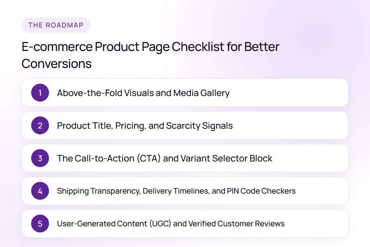
2. Product Title, Pricing, and Scarcity Signals
The area immediately adjacent to your product imagery (or directly underneath it on mobile screens) contains the primary transactional data points. Ambiguity here causes instant drop-offs.
Structure your commercial product details using this tested hierarchy:
| Page Element | Best Practice Standard | Conversion Purpose |
|---|---|---|
| Product Title | Clear, descriptive, keyword-rich (e.g., "100% Pure Mulberry Silk Pillowcase – 25 Momme") | Instantly confirms to the buyer that they found the exact item they searched for. |
| Review Star Badge | Star rating with total review count anchor link (e.g., "★ 4.9 (342 Reviews)") | Provides immediate social validation before the user reads detailed specs. |
| Price Clarity | Bold Selling Price + Strikethrough MRP + Percentage Savings Badge | Highlights tangible financial value and deal attractiveness clearly. |
| Inclusive Tax Notice | "Inclusive of all taxes" displayed under the price | Prevents surprise checkout abandonment when shoppers realize tax is added. |
| Low-Stock Alert | Real dynamic inventory indicator (e.g., "Only 4 left in stock") | Generates ethical urgency without resorting to fake countdown timers. |
For brands seeking complete multi-channel growth systems, explore our specialized ecommerce marketing agency programs.
3. The Call-to-Action (CTA) and Variant Selector Block
The purchase button is the single most important interactive element on your entire website. If your variant buttons are clunky or your primary CTA is difficult to find, shoppers will abandon the page.
Implement these essential CTA ergonomics:
- High-Contrast, Full-Width Button: Make your primary "Add to Cart" or "Buy Now" button a bold, contrasting color that stands out distinctly from the rest of your page palette.
- Persistent Mobile Sticky Button: On mobile devices, as the user scrolls down to read reviews or specifications, keep a compact sticky bar pinned to the bottom of the screen with the product thumbnail, price, and a direct "Add to Cart" button.
- Intuitive Swatches and Visual Selectors: Replace boring dropdown menus with clickable color swatches and clear size pills. When a customer selects a color swatch, the primary image gallery should automatically switch to display that specific color variant.
- Interactive Size Chart Modal: If selling apparel, footwear, or jewellery, include a clear "Size Guide" link directly above the size selector that opens an easy-to-read popup containing exact body measurements in both inches and centimetres.
For complex retail platforms requiring bespoke e-commerce architectures, our developers build robust storefronts through our ecommerce website development division.
4. Shipping Transparency, Delivery Timelines, and PIN Code Checkers
In Indian e-commerce, the single biggest objection right before checkout is: "When will this reach my doorstep?"
If a shopper has to proceed all the way through checkout to find out whether you deliver to their city or how much shipping costs, they will bounce.
Eliminate delivery anxiety on the product page itself:
- Instant Postal PIN Code Estimator: Allow shoppers to enter their 6-digit postal PIN code on the product page to see estimated delivery dates (e.g., "Delivery by Friday, Nov 12 to 313002").
- Clear Free Shipping Thresholds: State prominently: "Free Shipping on all orders above ₹999."
- Cash on Delivery (COD) Availability Badge: Clearly indicate whether Cash on Delivery is supported for that specific item.
- Transparent Return & Exchange Policy Summary: Place an expandable accordion directly beneath the buy button outlining your return window (e.g., "Hassle-free 7-day exchanges. No questions asked.").
5. User-Generated Content (UGC) and Verified Customer Reviews
Shoppers trust other consumers far more than they trust self-promotional brand advertising. A product page with fifty authentic customer reviews featuring real photos will consistently outperform a slick corporate page with zero reviews.
Build an authoritative customer review ecosystem:
- Prioritise Photo and Video Reviews: Use modern review platforms (such as Judge.me, Loox, or Okendo) that incentivize customers to upload smartphone photos of the delivered product.
- Review Search and Filter Tabs: Allow prospective buyers to filter reviews by star rating, review topic (e.g., "Quality", "Fit", "Delivery"), or photos-only.
- Verified Buyer Badges: Clearly display a "Verified Buyer" tag next to customer names to prove authenticity.
- Community Question & Answer (Q&A) Section: Include an interactive Q&A widget where prospective buyers can ask specific questions and your customer support team can publish official answers publicly for future shoppers to read.
FAQs
What is a good conversion rate for an e-commerce product page?
In the Indian e-commerce market, a healthy product page conversion rate typically ranges between 1.8% and 3.5% for consumer goods with an Average Order Value under ₹2,000. For high-ticket luxury products (above ₹5,000), typical conversion rates hover between 0.8% and 1.8%.
Should I show out-of-stock products on my website?
Yes, but never leave an out-of-stock product dead. Replace the "Add to Cart" button with a "Notify Me When Available" button that captures the shopper's email address or WhatsApp number. This recovers lost sales and provides real customer demand data for your inventory re-ordering.
Are customer review widgets slow to load?
Third-party review widgets can cause heavy layout shifts if not configured properly. Ensure your review app is integrated via modern Shopify App Blocks and uses asynchronous loading so your core product photography and pricing render before the review scripts execute.
What is the most effective way to decrease product returns?
The most powerful way to reduce returns is providing accurate size guides, detailed video try-ons, and real customer photo reviews. When customers see how a garment or accessory looks on diverse body shapes in natural daylight, they make much more accurate purchasing decisions.
Next Steps for Your E-Commerce Store
Your product page is the final bridge between your marketing investment and business revenue. By systematically eliminating customer doubts through rich visual galleries, transparent delivery timelines, frictionless mobile CTAs, and authentic social proof, you turn casual visitors into confident, loyal buyers.
If your e-commerce brand wants to optimize its storefront for maximum conversion rates and scale paid advertising profitably, explore our specialized ecommerce marketing agency services or contact IPrix Media for a comprehensive store conversion audit today.